I finally decided what the application of my model would be. I want the hand gesture recognition model to be used to interact with complex data visualisations, especially scientific ones. This aligns with my interest in biology, coding and creativity. Besides, some of the scientifc data visualisations look difficult to interact with, making it “unattractive” for users to explore. By introducing a more intuitive mode of interaction, I hope to make this type of visualisations more accessible.
I explored different resources for visualisations: https://github.com/keller-mark/awesome-biological-visualizations?tab=readme-ov-file
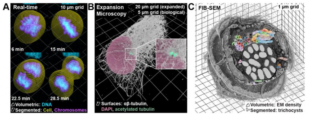
image source: https://www.biorxiv.org/content/10.1101/2025.01.09.632153v1.full
FInally, I chose microscopic data to work with. https://cfe.allencell.org
The Allen Cell Explorer (allencell.org) is the public portal of the Allen Institute for Cell Science, a Seattle-based nonprofit created by the late Paul G. Allen to make fundamental cell biology openly available.
Example of the data visualisation:

The Allen Cell dataset is a public gallery of 3-D “photos” of living human stem cells, where each image shows one cellular part glowing so you can easily pick it out, plus two helper colours that mark the cell’s outline and its DNA. There are hundreds of thousands of these stacks, all downloadable for free and viewable in common imaging or 3-D-graphics tools, so anyone—from hobbyist coders to teachers—can spin, slice, and explore the inner layout of real human cells without needing lab equipment or deep biology know-how.
This is the results I was aiming at:
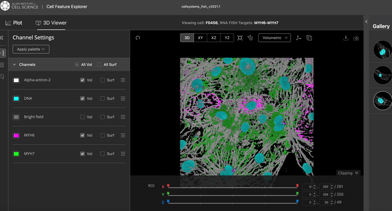
The video was taken from the Cell Feature Explorer. It is an interactive web tool that lets you visualise, compare, and explore thousands of real 3-D images of human stem cells—specifically, genetically modified cells where a particular structure (like the nucleus or mitochondria) is fluorescently tagged.
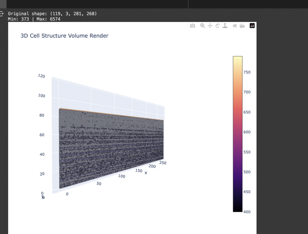
I worked on the code that would allow me to visualise this dataset in 3d. I am trying to visualise the 3D cell data using Plotly, an open-source graphing library for Python.
First, I import the four libraries I’ll need—NumPy so I can do fast array maths, tifffile so I can open the multi-slice TIFF that came off the microscope, Plotly for interactive 3-D graphics, and Matplotlib for a quick 2-D sanity check.
Example of a middle slice of the cell:

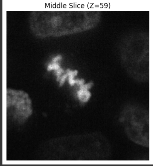
Next, I pull the filename out of image_key, read the stack into img, and print its raw shape; if the file has multiple colour channels, I keep only the first one so that my data sit in a simple (Z, Y, X) grid. I then rescale every voxel so the dimmest value becomes 0 and the brightest becomes 255, casting the result to uint8 so the rendering engine behaves predictably; while I’m at it, I tell myself how big the stack is and how many voxels actually contain signal. To make sure the image looks right before I go 3-D, I display the middle optical slice with Matplotlib. Satisfied, I build three coordinate arrays with np.meshgrid, flatten those grids (and the intensity array) into 1-D vectors—exactly what Plotly’s go.Volume wants—then pass them to a volume trace. I dial the opacity down to 0.15 so inner structures stay visible, ask Plotly to draw twenty iso-surfaces for extra detail, filter out faint background voxels below 40, keep a grayscale colour map for a microscope feel, and hide the bounding-box caps so the volume looks like it’s floating. Finally, I set a sensible window size and hit fig.show(), opening an interactive viewer where I can rotate, zoom and explore the cell’s 3-D architecture.
For some reason, I only got it working to be shown in a 2D scale, which is not what I intended to visualise at first. This is not what I expected, because the visualisation was not shown in a 3D format no matter how much I try to visualise it. I suspect the problem us the limitation of the Plotly library, as well as Google Collab Pro notebook.
I also created a 3-D “heat-map” of the one cellular part to see and explore: different ways of visualising the data.

As I was not fully satisfied with the data visualisation, I continued to explore what data I should visualise.
The code of the visualisaiton iteration can be found here: https://colab.research.google.com/drive/1KDbEtqlR92HjtRRn1E-jFN91fQDOMTp2?usp=sharing
Leave a Reply